
At times, help centers didn’t know what they wanted to look like. Everyone was on their own, and there was no proven design template. Yet, these days are long gone, and we now know that designs such as buystockswithus.com are pretty bad.

Note: By the way, the site recently got an update that is just as “great” as the old one.
Source: Pinterest
However, with so many layouts and design languages today, picking the best one is hard and practically impossible for a newcomer. And what is the best anyway? Aren’t all websites the same? Well, to answer this and more, we’ve decided that it is time to diversify our approach from traditional help desk software and cover some very good help center website designs. It still has the word help, which many companies want to implement alongside their help desks. Thus, without further delay, let’s get into the excellent help center UX world.
5 Tips To Follow When Creating A Help Center Website
Now, before we go straight to the best help center websites, we’d like to cover some tips. But some of you might ask, what’s the point? The answer is quite simple: We want you to learn something new, and it will make our work less complicated since we won’t have to explain everything over and over. So, here are 5 website help center tips that you should use as your own.
Tip #1: Provide A Clear Path
One of the most common issues companies make when they create a help center website is that they don’t lead their customers. Those who seek help enjoy being led to the solution. Your entire layout has to point the user to the solution naturally, and the path to the answer itself has to be from point A straight to point D, with no B or C in between.
This might seem impossible, but in all honesty, it isn’t. You have to figure out what corners can be cut and what paths your customer might have to take. Take, for instance, written articles. Make your website pull out posts based on keywords and synonyms your customer has inputted in the search bar in the recommended section.
Don’t let them search independently, and make a couple of decisions for them. You’ll notice that the issue is solved faster. If the issue is solved faster, the customer will be more satisfied.
Tip #2: User-Driven Language
Whenever you hear the term “user-driven language,” it means an active voice. Don’t be passive in your posts; make your website a glossary of search terms. In other words, you have to be on the same page as your customers and use the same words and the same phrases as your users.
Read also: How to speak the customer's language
And if your product or service is pretty technical, think outside of your surroundings and imagine how your oldest relative might search for help. Once you put yourself in those shoes, try to decode and break it down to your readers. Your users will love it, and your agents will take advantage of it since they’ll have a better time searching for information.
Tip #3: Keep Data Updated
Your knowledge base, blog, website service page, and help center are never “finished”—like never. You need to keep your data up-to-date with the latest and greatest and constantly improve your stuff in terms of facts and accessibility.
The best way to keep things fresh and organized is to devise a periodic review schedule. In this review schedule, include your entire internal database, your public knowledge base ( complete with visual data), and your FAQs. Pay good attention to the latter, as FAQs are the ones that are used the most. And while we are still on the subject, ensure your customers and staff can rate articles. This will allow you to see which ones need revision much sooner.

Tip #4: Make Searching Easy For Customers
Now that you know what steam you should write your content on, make sure it is easily discoverable. And we aren’t talking about keywords this time. What you have to do is to include a search bar at the top of your website. Once done, it would also be good to label or tag your articles.
Another vital thing to ensure is SEO visibility; it will help people find info and might even attract new customers. And before we close off this section, always add links to stuff such as support lines, relevant articles, and the contact form. Allow your customers to reach out to you quickly.
Tip #5: Mobile Optimized
And the last tip on our list is mobile optimization. We won’t be linking any statistics as we think that by 2020, it is clear that the better half of the internet use their phones to shop, view info, work, and entertain themselves. What you have to do, however, is to optimize your help center website to be as mobile-friendly as possible.
The last thing you want to do is frustrate your customers by not providing a mobile-ready website. Make sure that your help center looks the same on all screens and OSs and does not eat up data plans like crazy.
Examples of Good Designs
If you are tired of reading our tips, well, that's lousy news because we aren’t done with help centers yet. We hand-picked a couple of fantastic help center website designs that you can and should mimic.
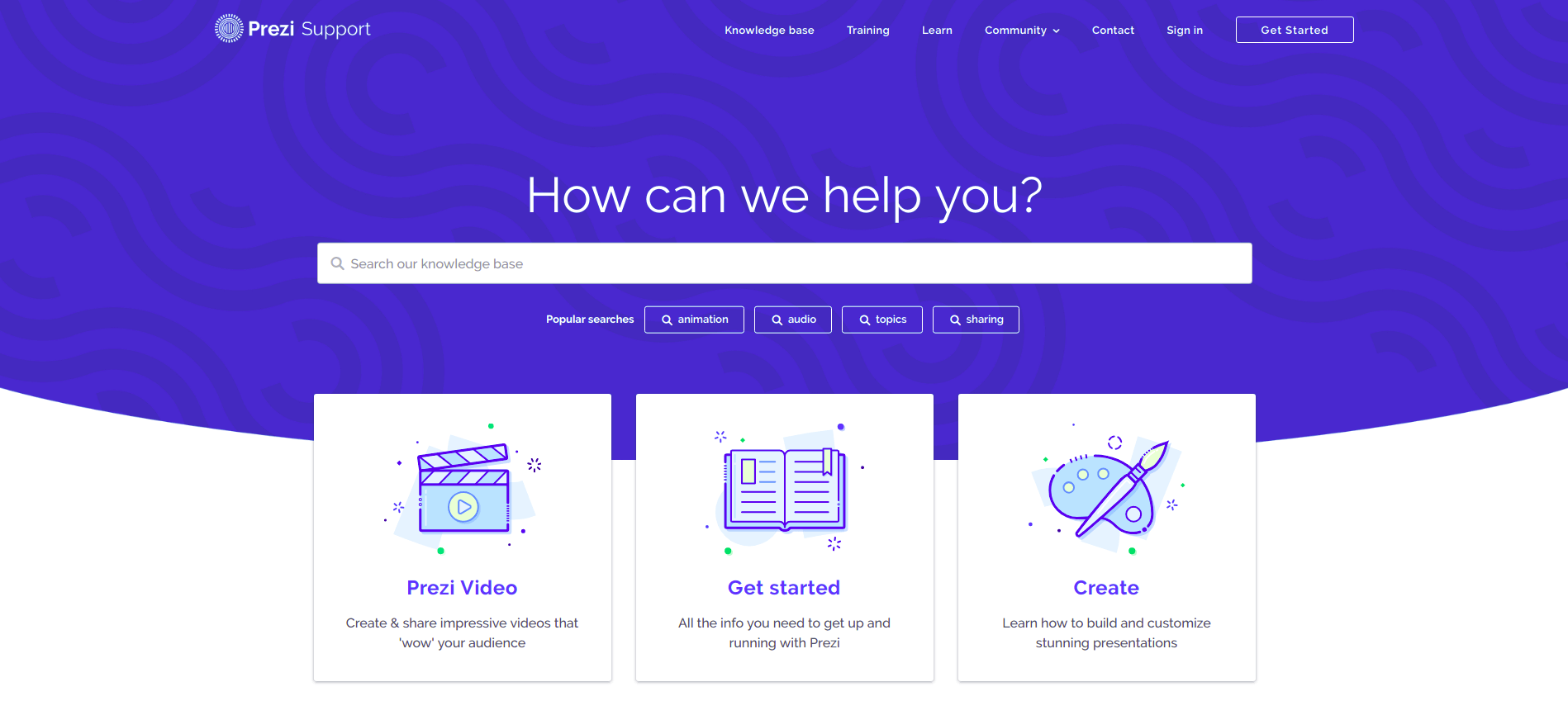
Prezi Support Center—The first thing you’ll notice is that right out of the gate, you get a huge search bar coupled with popular terms. This alone is enough to get the user started. But the company didn’t end there. The lower half of the screen contains huge plates that show all the possibilities the product offers.
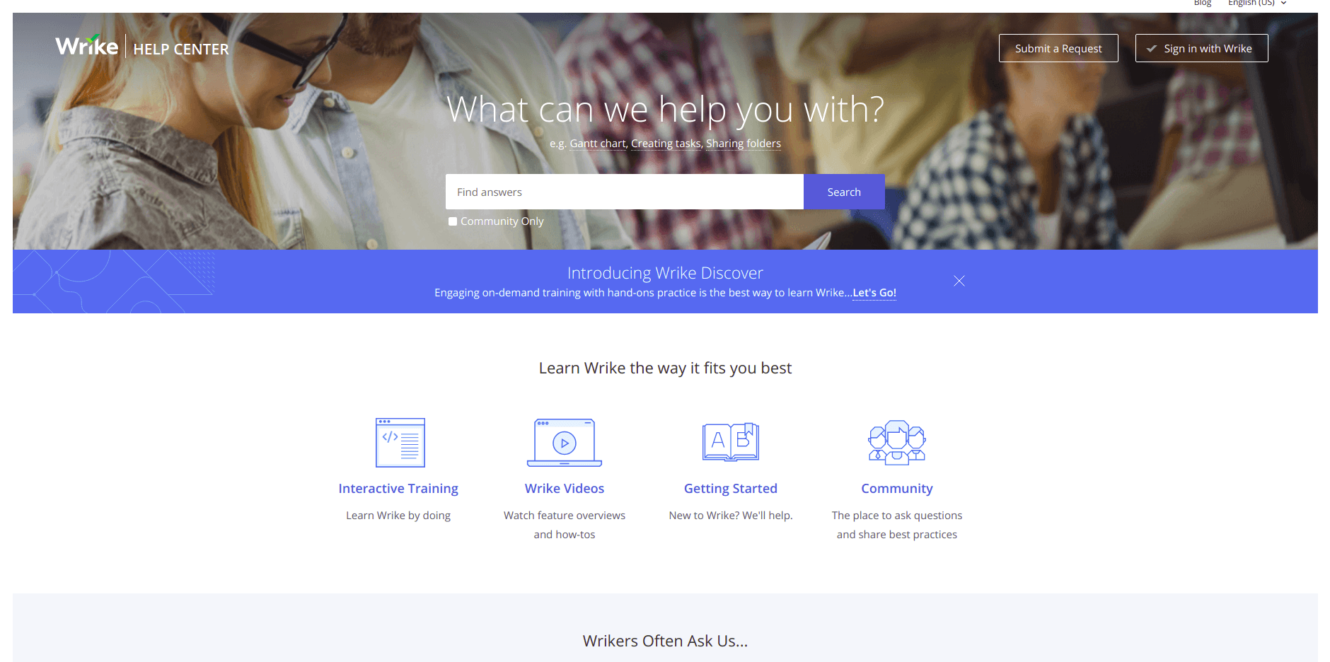
Wrike Help Portal — Again, similar to our previous entry, this help center also has a long search bar at the center and a few blocks with info down below. However, where it differs is in the position of the FAQ section. It’s right below the blocks. It just feels natural that it’s there and will incentivize you to check it out first.
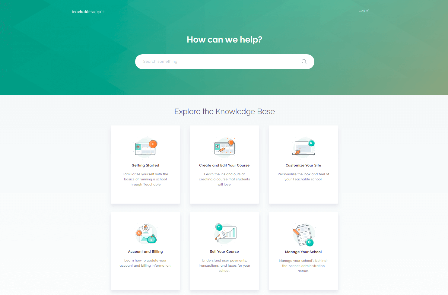
Teachable Support—By now, you should realize that a big, long search bar at the center is the standard. But what makes this one good is the fact that at the very bottom, you have a contact button. It is clear that it is not part of the menu or the info plates. Moreover, returning to the search bar, it always stays visible, no matter how far you’ve scrolled.
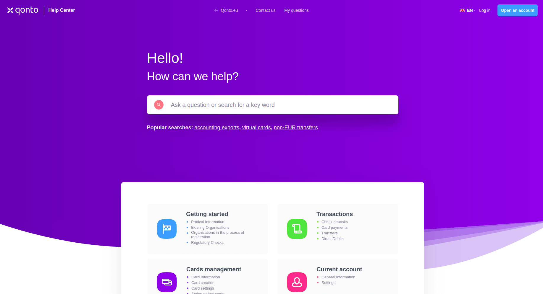
Qonto Help Center — Now one of the best parts of this help center is that it is highly animated and easy to read. Each block zooms in for enhanced readability and each block is written as an outline that is easy to digest. The site also offers several contact options, something that previous entries don’t include.
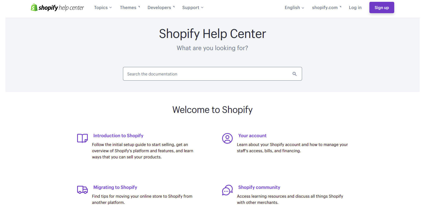
Shopify Help Center — Shopify made their help center pretty straightforward. Once you visit it, you see a long list of help sections by category. There are no distracting graphics, no unnecessary animations, just content and search. Speaking of the search, the search bar is pretty standard because it is context-aware and relatively fast.
Final Notes
Setting up a help center isn’t something that might seem straightforward. You have to consider your user base, your content, and how well it will be presented. We hope our tips and examples helped you in one way or another. But for now, that is all we have. If you want more content like this, please let us know, and if you need to migrate your stuff, we can help you with that as well. Thanks for joining!


